Using mix-blend-mode with (partly) transparent images
The CSS property mix-blend-mode is super useful. Until now I mainly used it for fixed navigations that change the text colour depending on the underlying content. So the text is always "visible".
For a recent project I needed to generate "monotone" images. So the images should be tinted with a certain colour. While this works fine (explained for example by Ahmad Shadeed here) for photos, it doesn't work for images with transparent parts. The problem is that the transparent parts are filled with the background-color, while I want these parts to be transparent.
Here a simple example with an image and mix-blend-mode. On the left, the original image (Photo by Evie Shaffer: https://www.pexels.com/photo/b...). On the right, the image with mix-blend-mode: screen on a red background.

Here the same code with an image (Photo by Artem Zhukov: https://www.pexels.com/photo/c...) with transparent background:
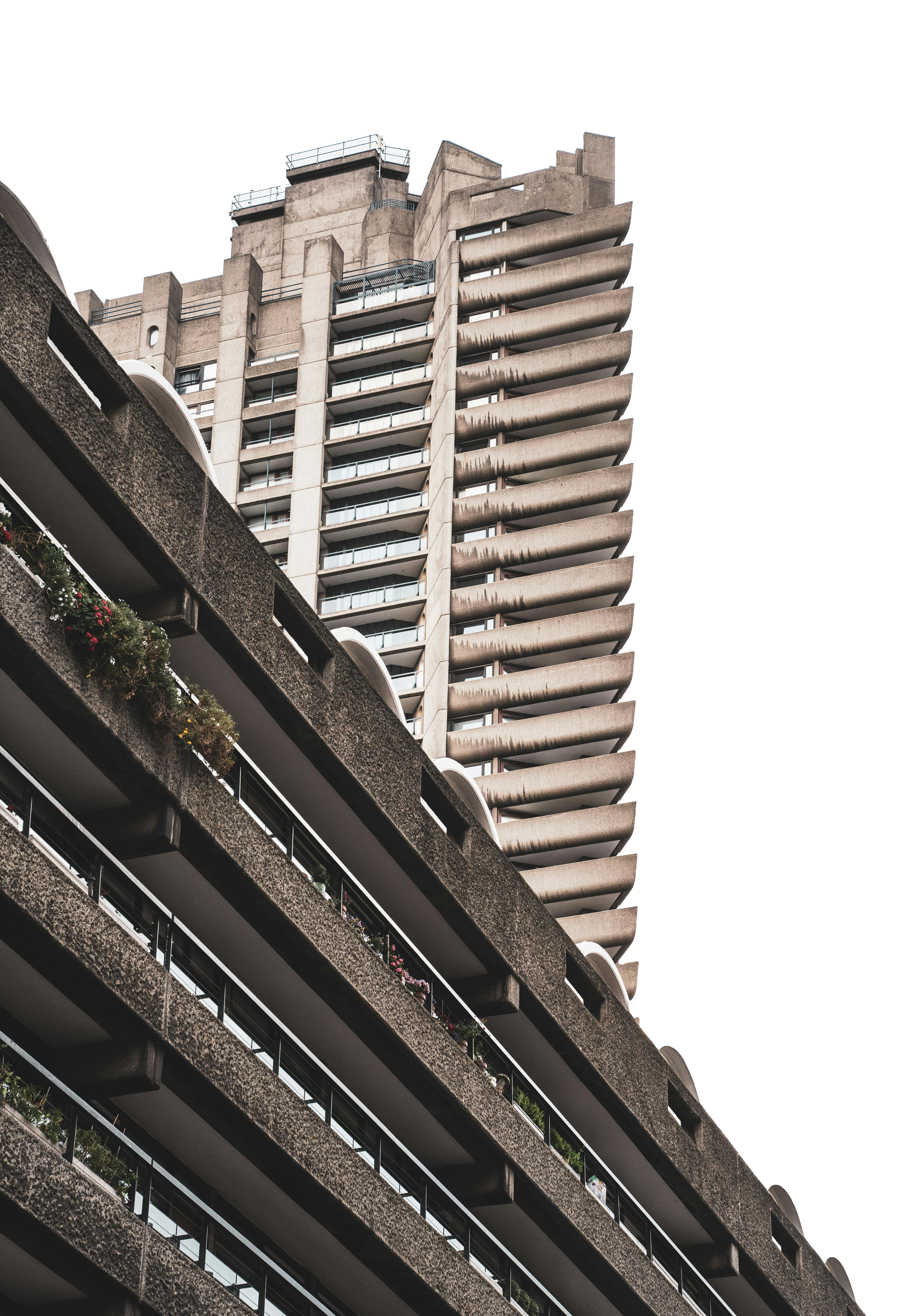
Here the problem becomes clear. The goal would be to keep the transparent parts invisible and apply the colour tint to the building only.
So my understanding of the problem was that the colour in the background should only be where the non-transparent parts of the image are. I thought about duplicating the image, changing the colour of the duplicate and using this instead of a background-color. While doing research about it, I found out you can use CSS filters to set elements to a certain colour but I wasn't happy with the result. Then I found out, you can use drop-shadow and combine it with translate.
The CSS property drop-shadow only affects the non-transparent parts of the image. Use it with the colour you would use as background-color. And here comes the magic: use an offset with a high value. Like 5000px. Then use the same value for translating the image itself. The result is that the drop shadow is directly behind the original image and so the mix-blend-mode works as intended.
Here an example:
<div class="drop-shadow-example">
    <img src="pexels-artem-zhukov-17330510.png" alt="a brutalist building seen from steet level" />
    <img class="duplicate" src="pexels-artem-zhukov-17330510.png" alt="" />
</div>
.drop-shadow-example {
    position: relative;
    overflow: hidden;

    img:first-child {
        mix-blend-mode: screen;
    }

    .duplicate {
        position: absolute;
        inset: 0;
        z-index: -1;

        filter: drop-shadow(0px 1000px 0 red);
        transform: translateY(-1000px);
    }
}